Plugged In Movie Review Site
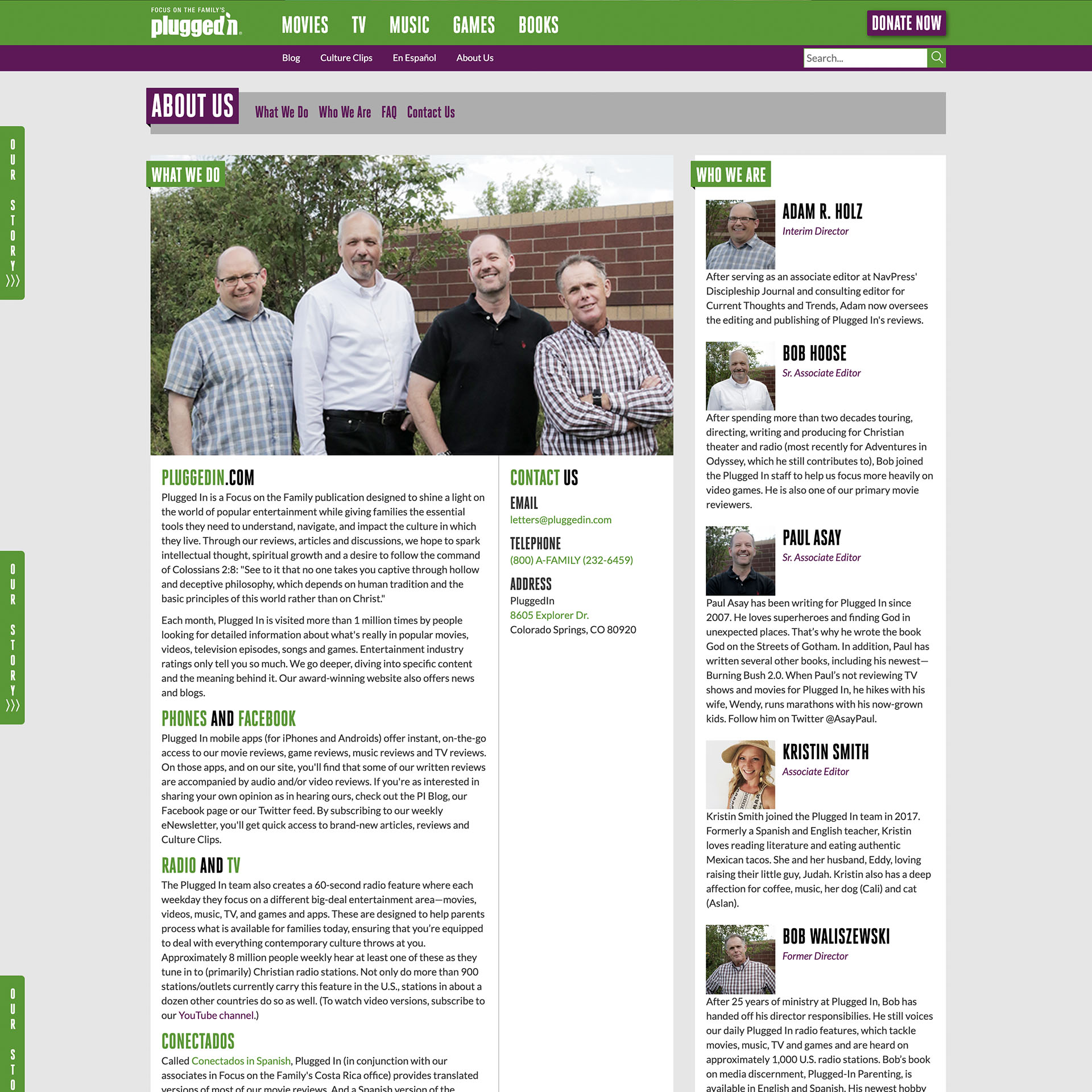
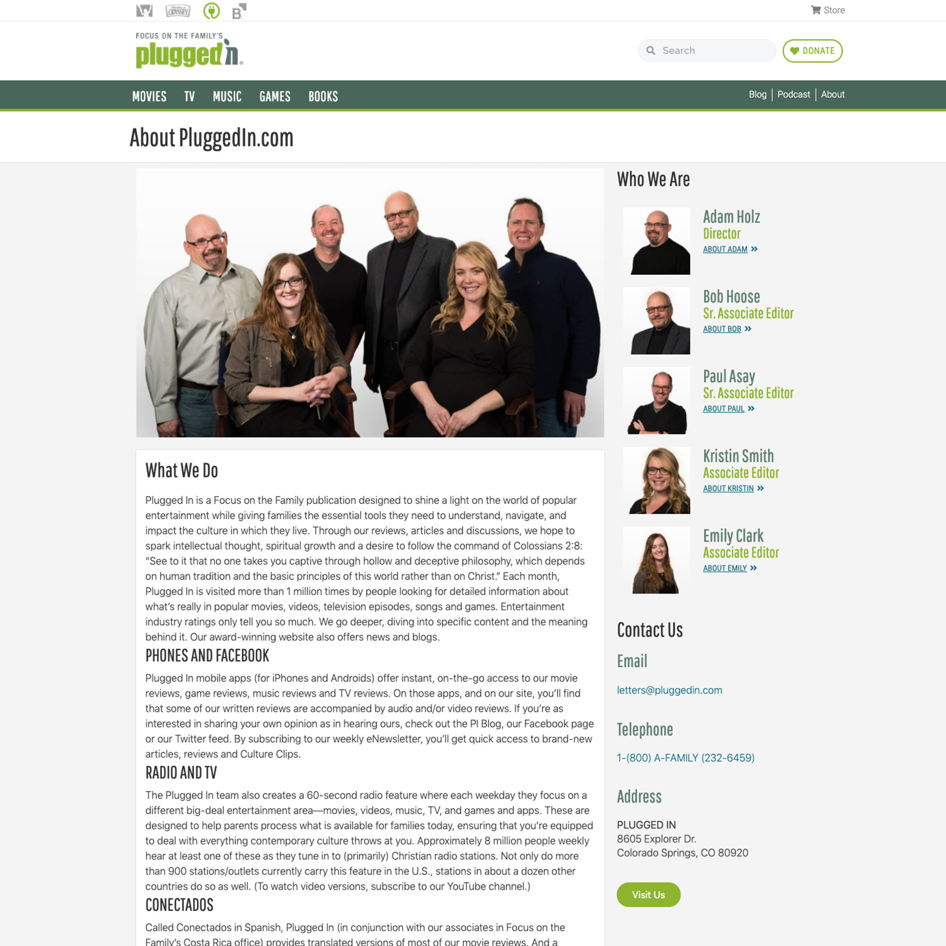
PluggedIn.com is a child brand of Focus on the Family, a Christian non-profit organization. Plugged In provides Christian reviews of popular entertainment media. The website was in need of a redesign to incorporate the new brand colors and logo.
Roles & Responsibilities
Stakeholder Inteviews
User Research & Competitive Analysis
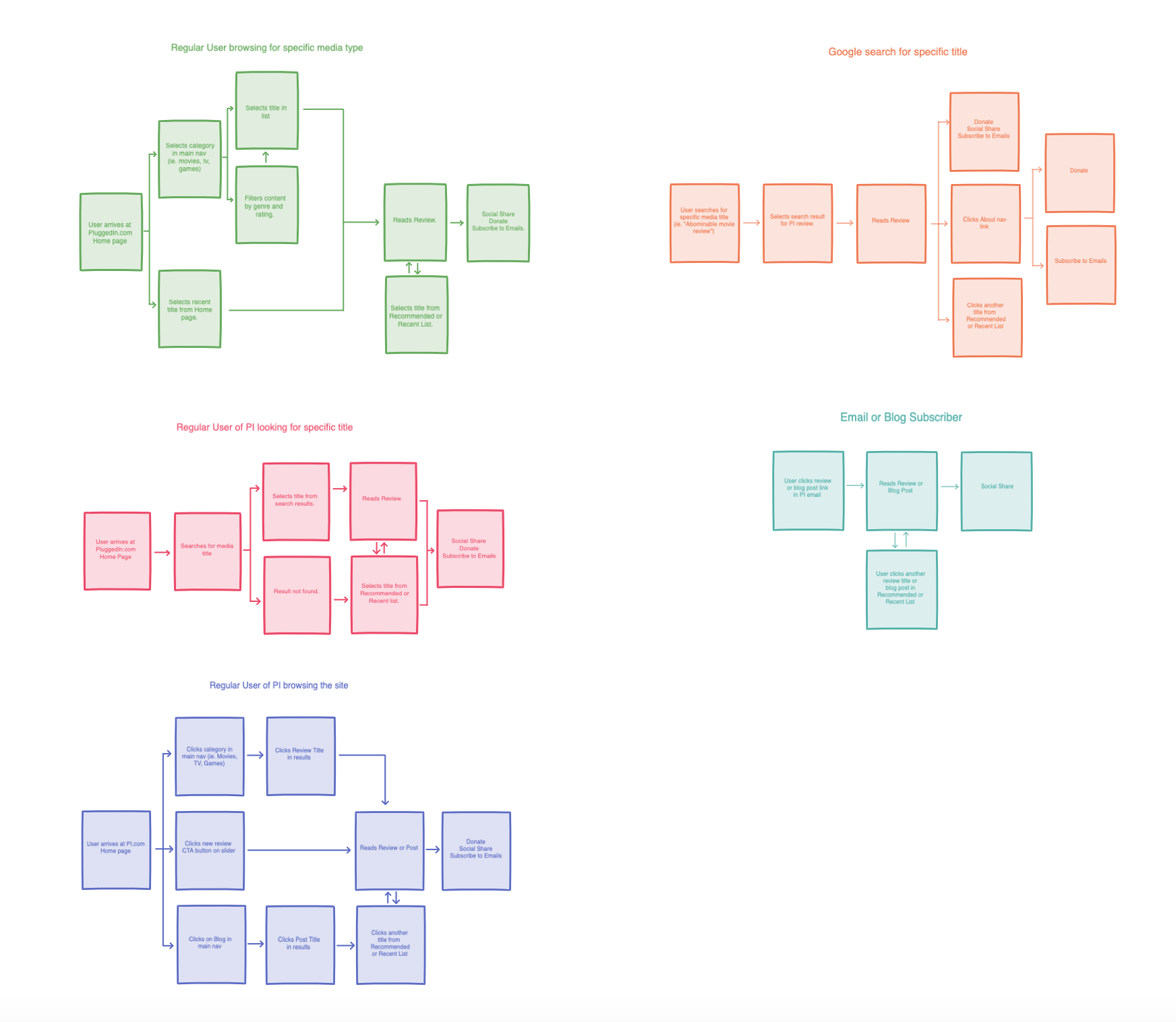
Information Architecture
Wireframing & Design
Development
The Challenge
The site was built on Contentful CMS and was not user-friendly to update, so the business wanted to migrate the site’s content to WordPress. The site already had a blog built on WordPress, so they wanted to align the site with the blog and have a cohesive user experience and design. The main categories of reviews (movies, TV, etc) had a poor filtering experience and made it difficult to browse the content. As one of Focus on the Family’s most well-known brands, it was important to integrate Focus’ other prominent brands in a way that is consistent with the newly-redesigned flagship site, FocusOnTheFamily.com.
Competitive Analysis
There are many other sites out there that offer movie and entertainment reviews. However, none offer trusted, Christian faith-based reviews. The closest competitor that offers reviews geared toward families with kids is Common Sense Media and their site is really well catered to parents that want to read reviews before their kids watch or consume the media. This aligns with the same target market as Plugged In, though their reviews are not faith-based.
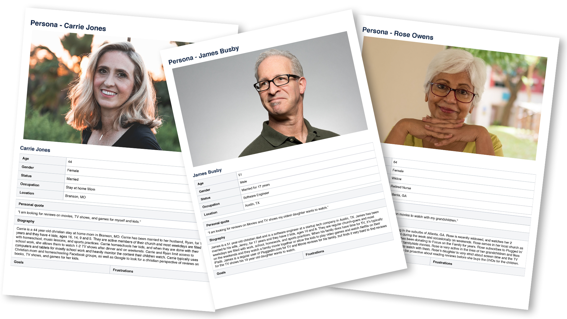
User Research & Personas
My initial use cases for Plugged In were mostly Christian parents. However, after doing a few user interviews, I was able to narrow my scope of users to Christian parents of children ages 7-18 that read media reviews for their family. With further data analysis and heatmaps, it was clear that the majority of users of the old site were return visitors searching for a specific review and to see what other new reviews are available.
Wireframes
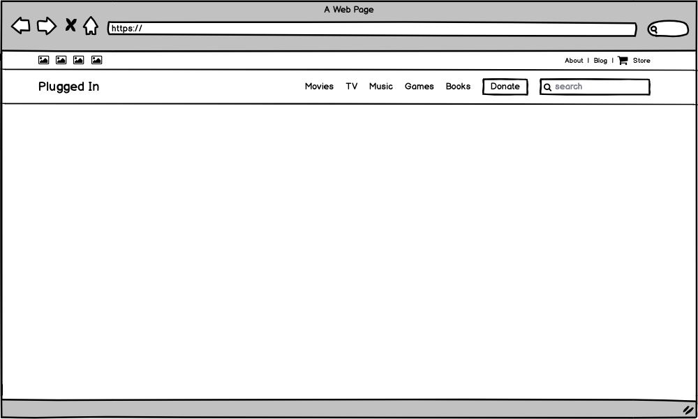
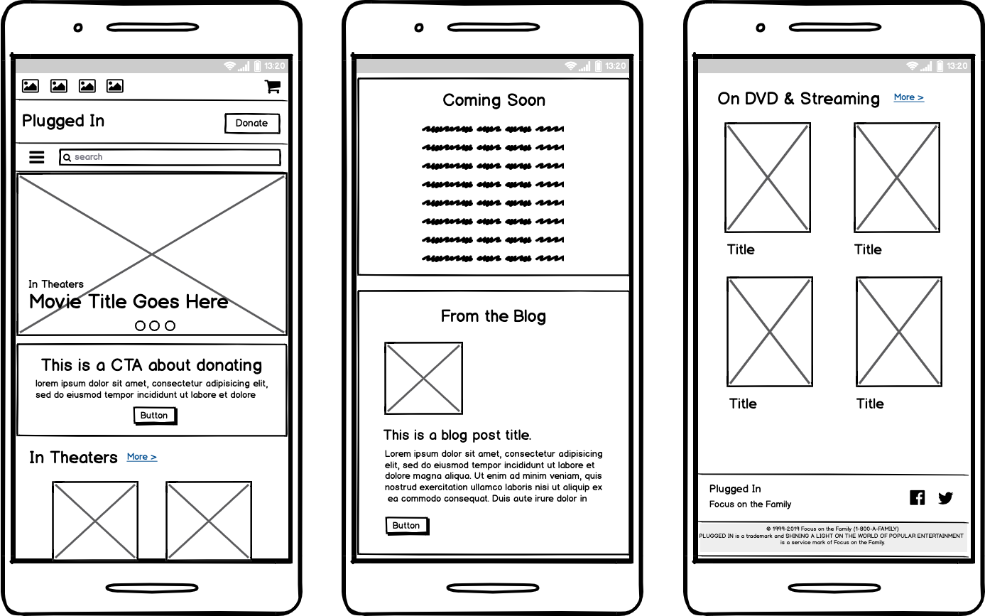
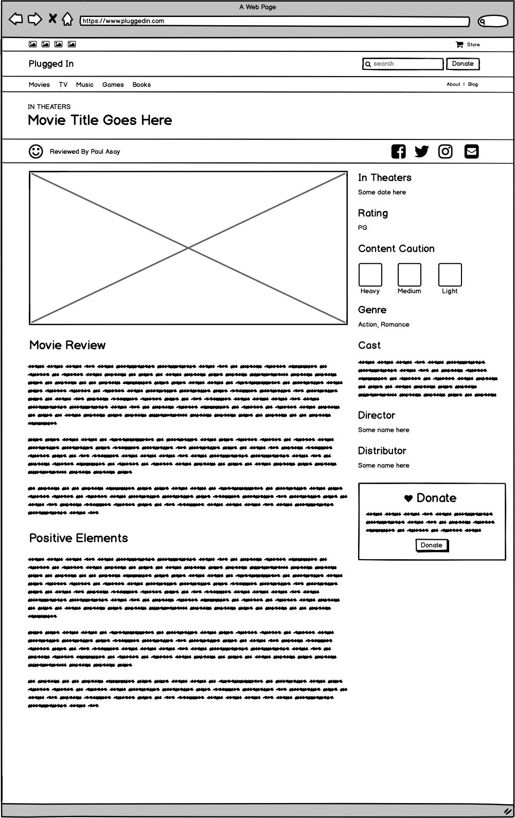
I used Balsamiq for wireframes. It was important to nail down the main header and footer navigations first, as those would be used on every page of the site and would be the main source of navigation for the user to browse and search the site.
Designs
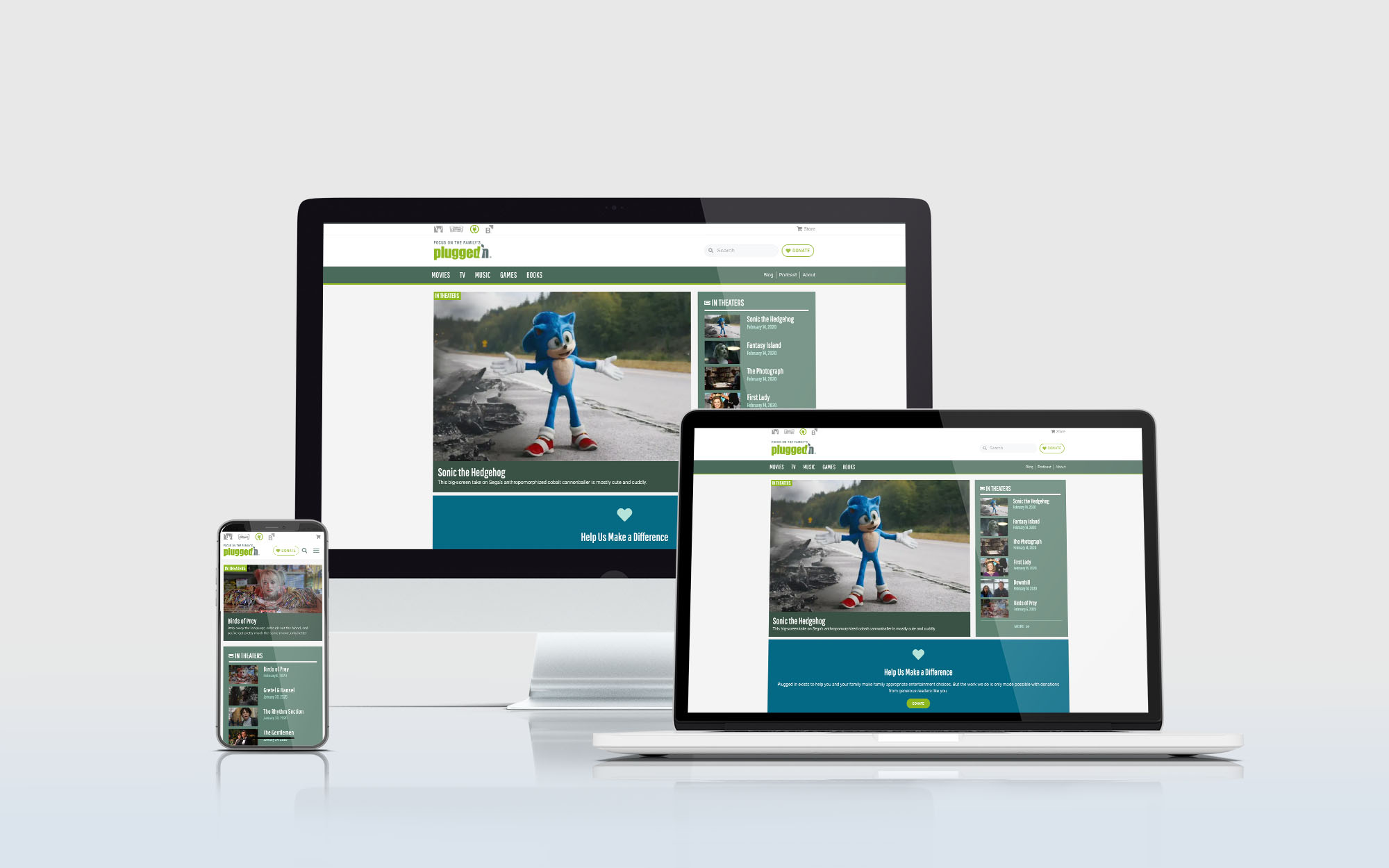
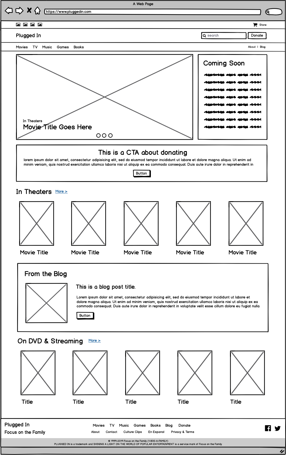
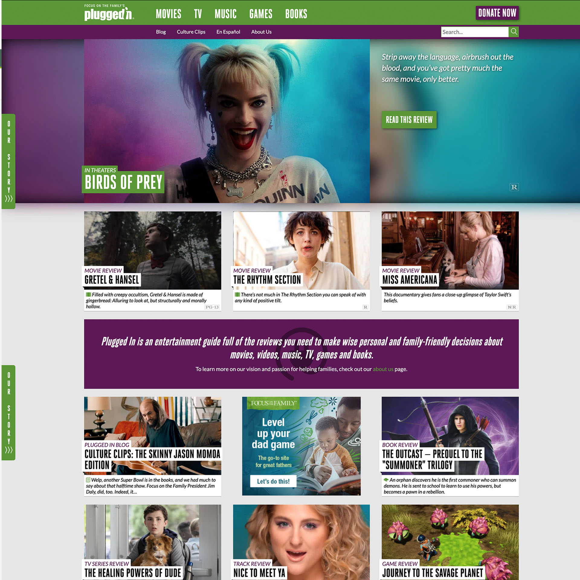
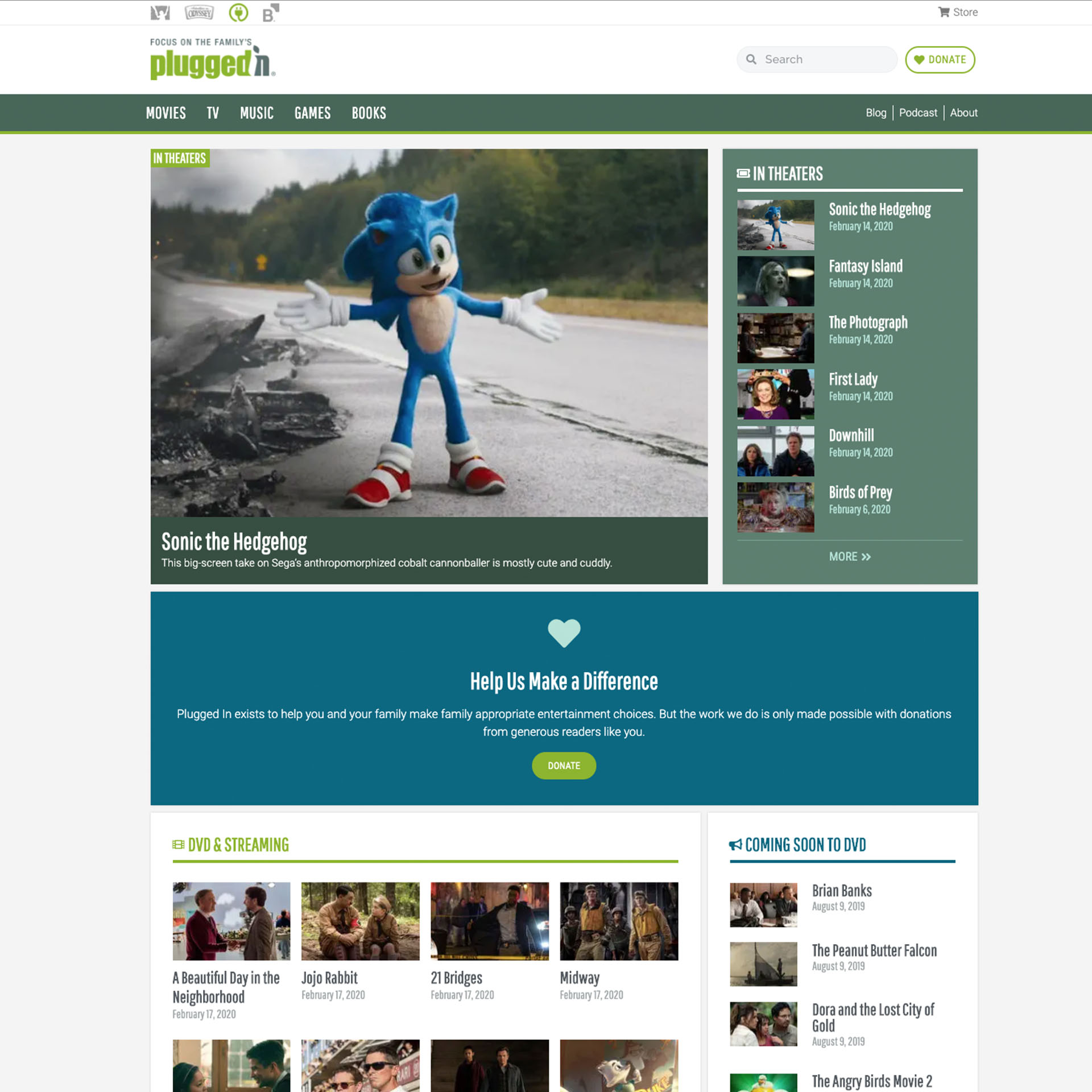
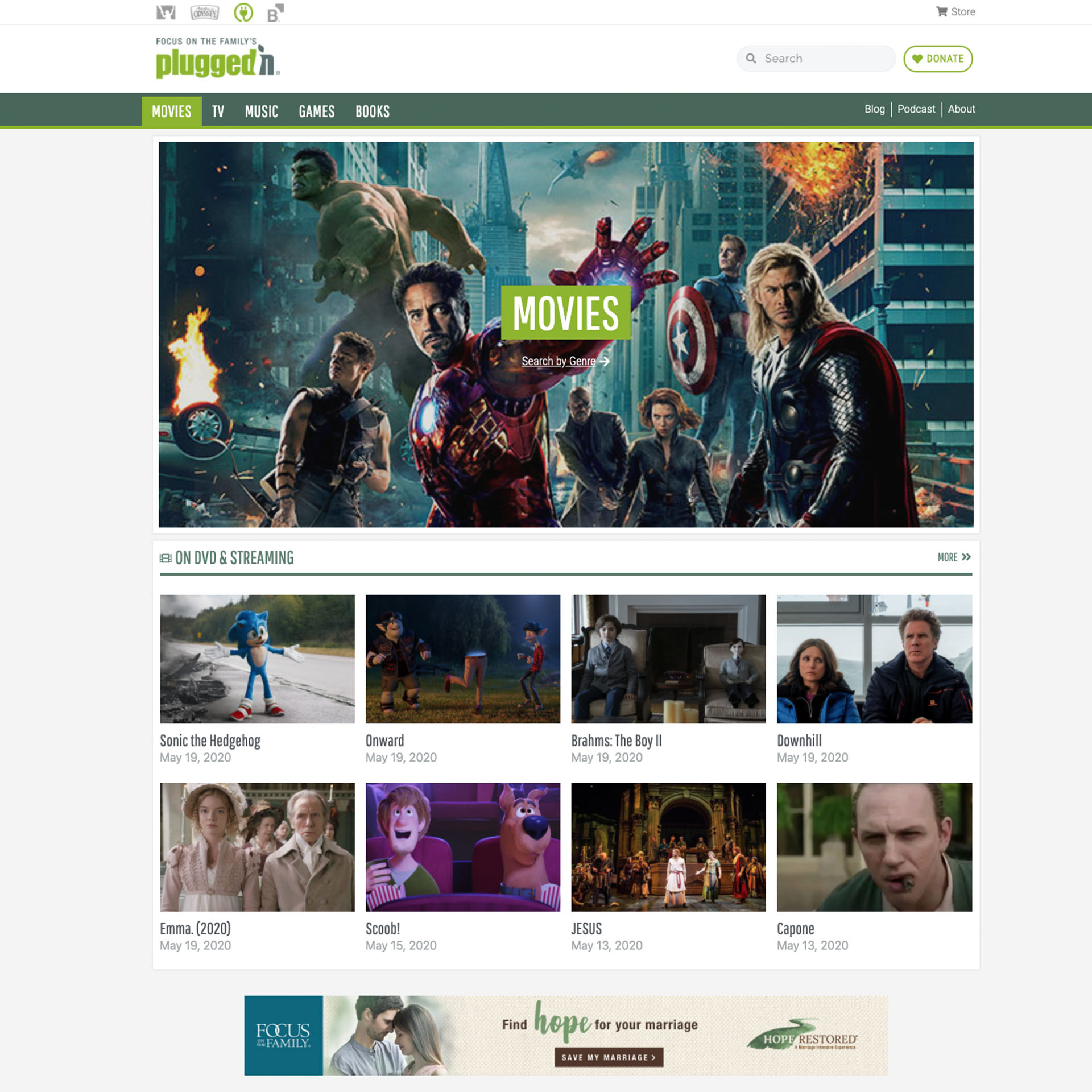
Heatmaps and behavior data showed that the search feature was one of the most highly used tools on the site. Therefore, it was important to make the search easy to find and easily accessible on desktop and mobile. The other item of importance was to subtly highlight our other top brands within the organization, so the brand bar at the very top of the site was added for consistency and brand recognition across Focus’ most well-known web properties.
The overall design is cleaner and aligns more closely to the Focus on the Family flagship site design. The content is laid out in order of importance with click data on the old site, but is also easy to change and test later. Other than search, the slider on the old site’s home page highlighted new movie release reviews, so we kept a featured review as the first section of content, along with a thumbnail list of other movie reviews that are in theaters. This is and all the sections dynamically update when new reviews are added, so new reviews are always showing on the Home page.
Lastly, the business needed a donation call-to-action that could align with their marketing campaign needs and can be changed/tested for increased conversion and donations. The blue CTA was designed with copy that reminds the user that if they like the reviews and keep coming back, they can donate to support the site’s efforts.
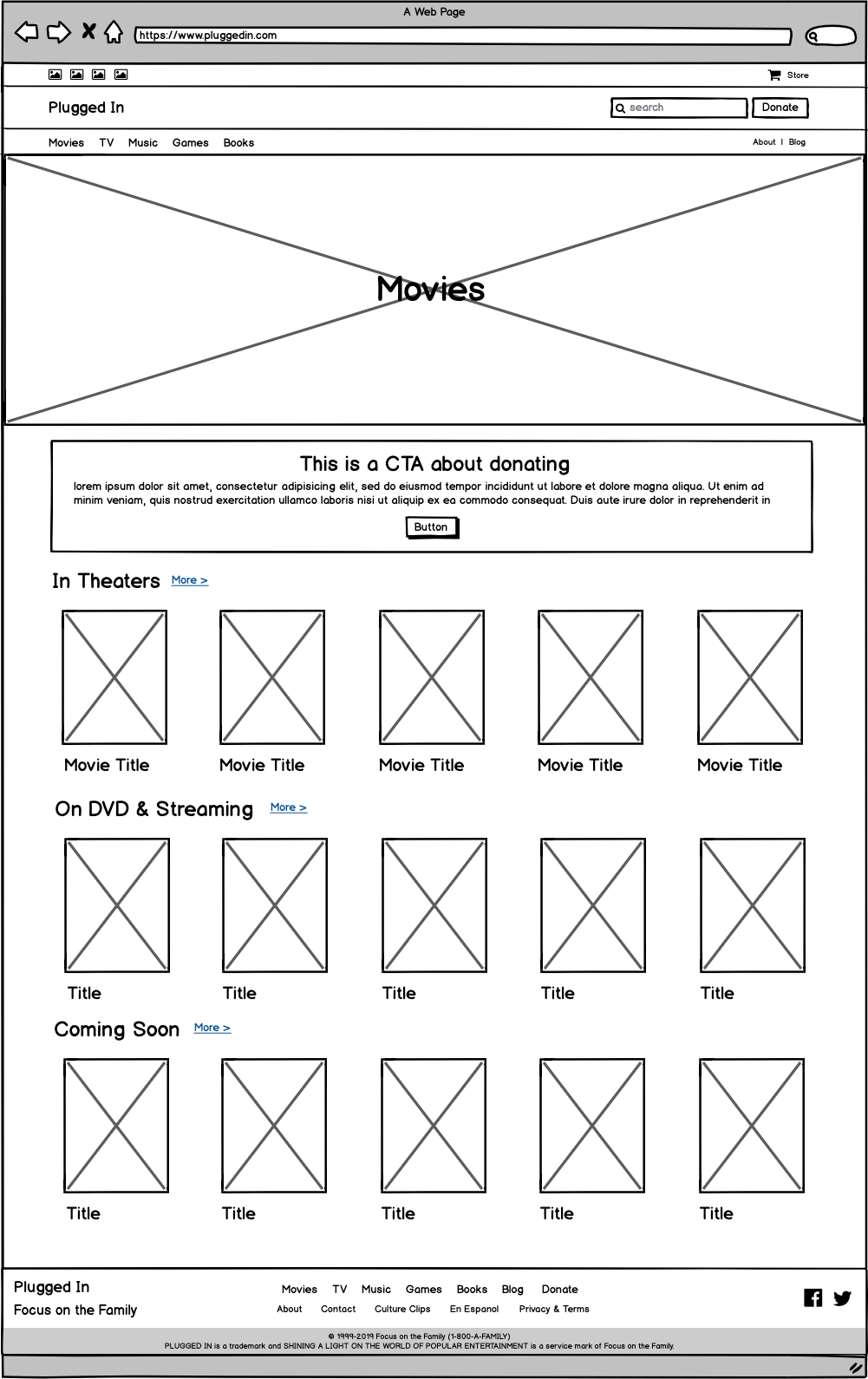
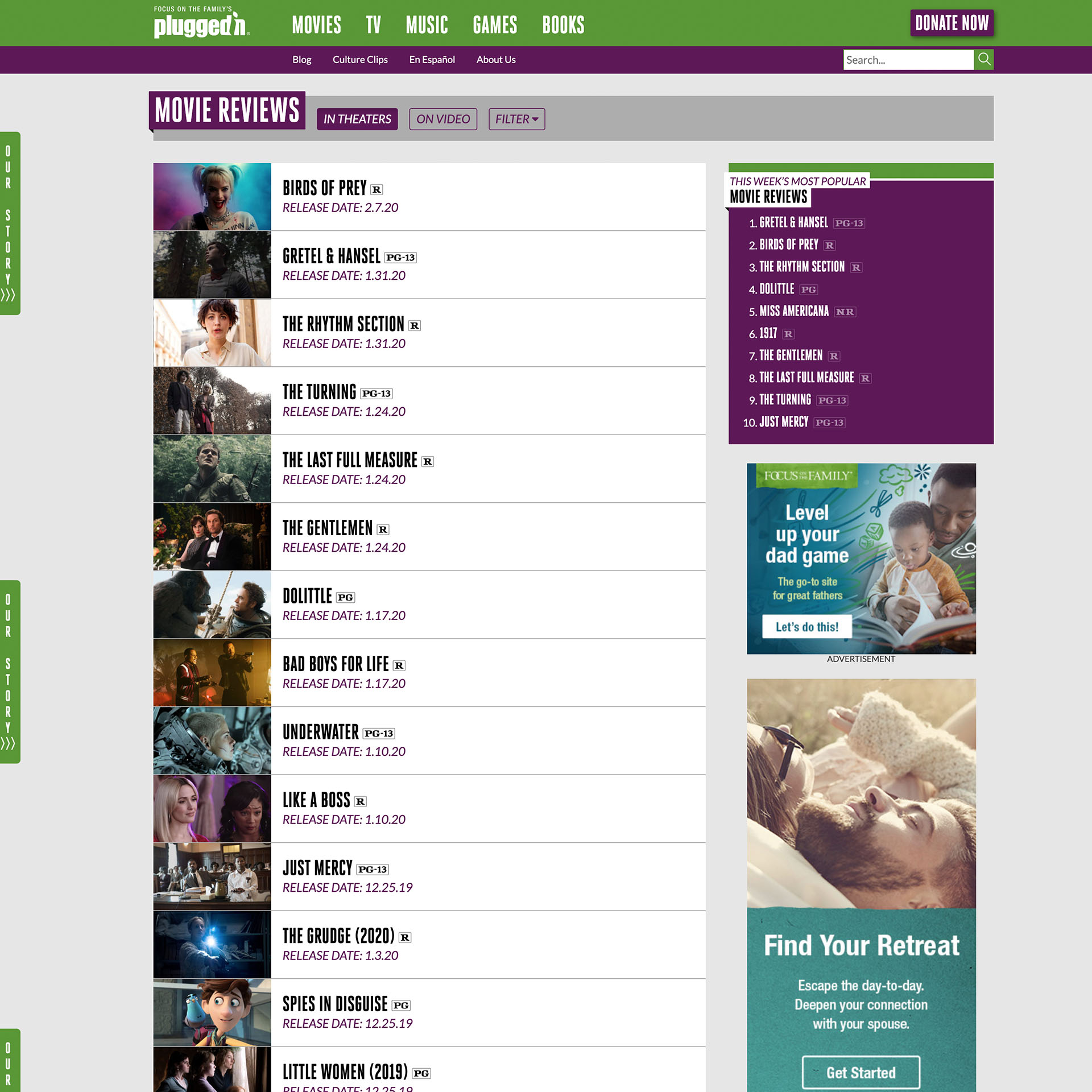
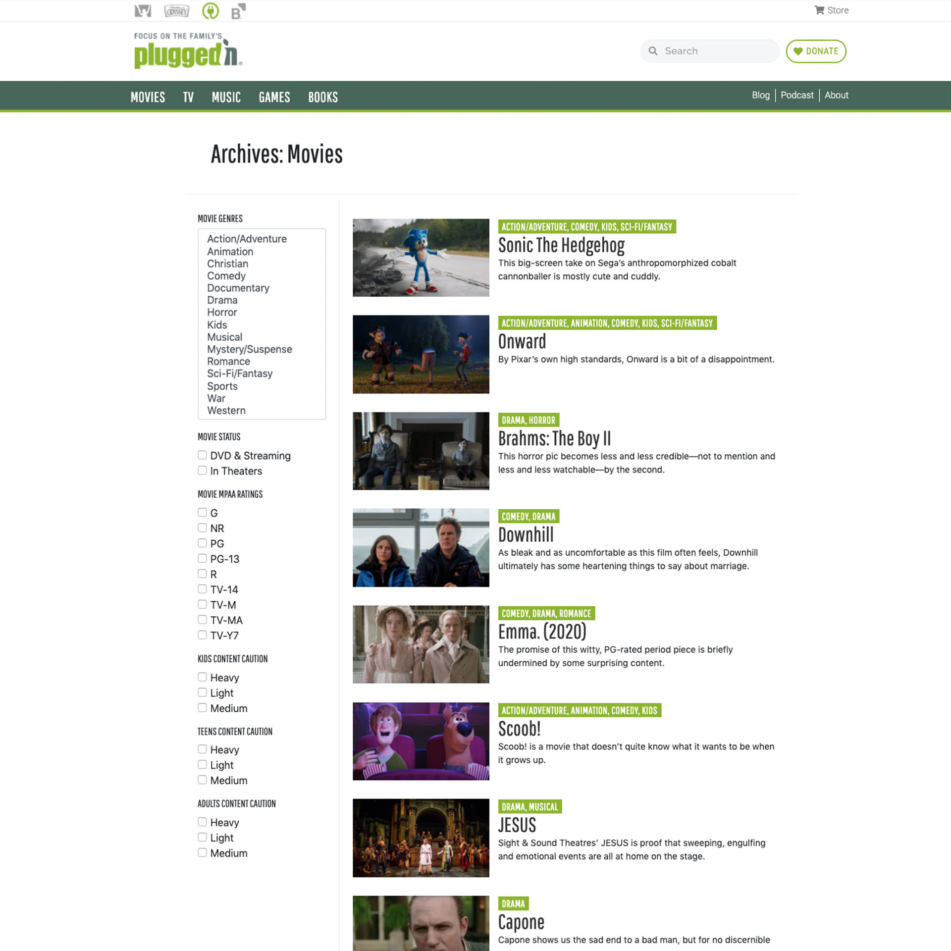
The new WordPress framework did not allow us to keep the old layout of the Category pages without custom development. Therefore, I came up with a layout that both limits the user’s visible content and narrows their choices to filter their choices. One the Movie category page, I limited the review thumbnails to 8 in each subcategory: On DVD & Streaming or In Theaters. The user can choose to see more if the latest 8 choices are not enough, or filter by genre and other filter options.
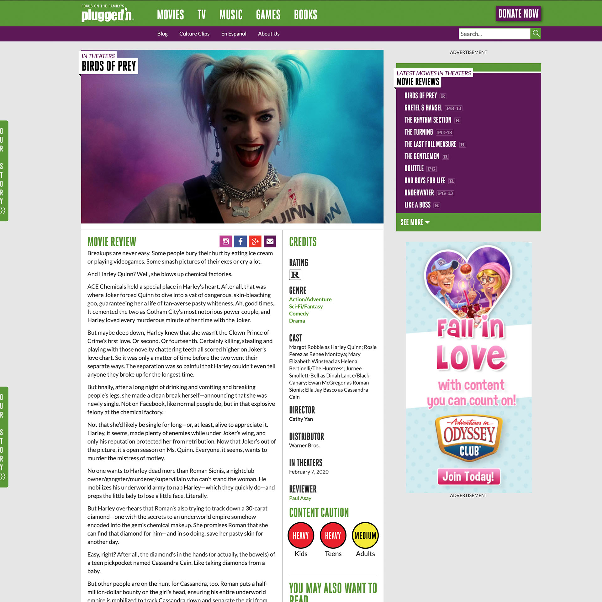
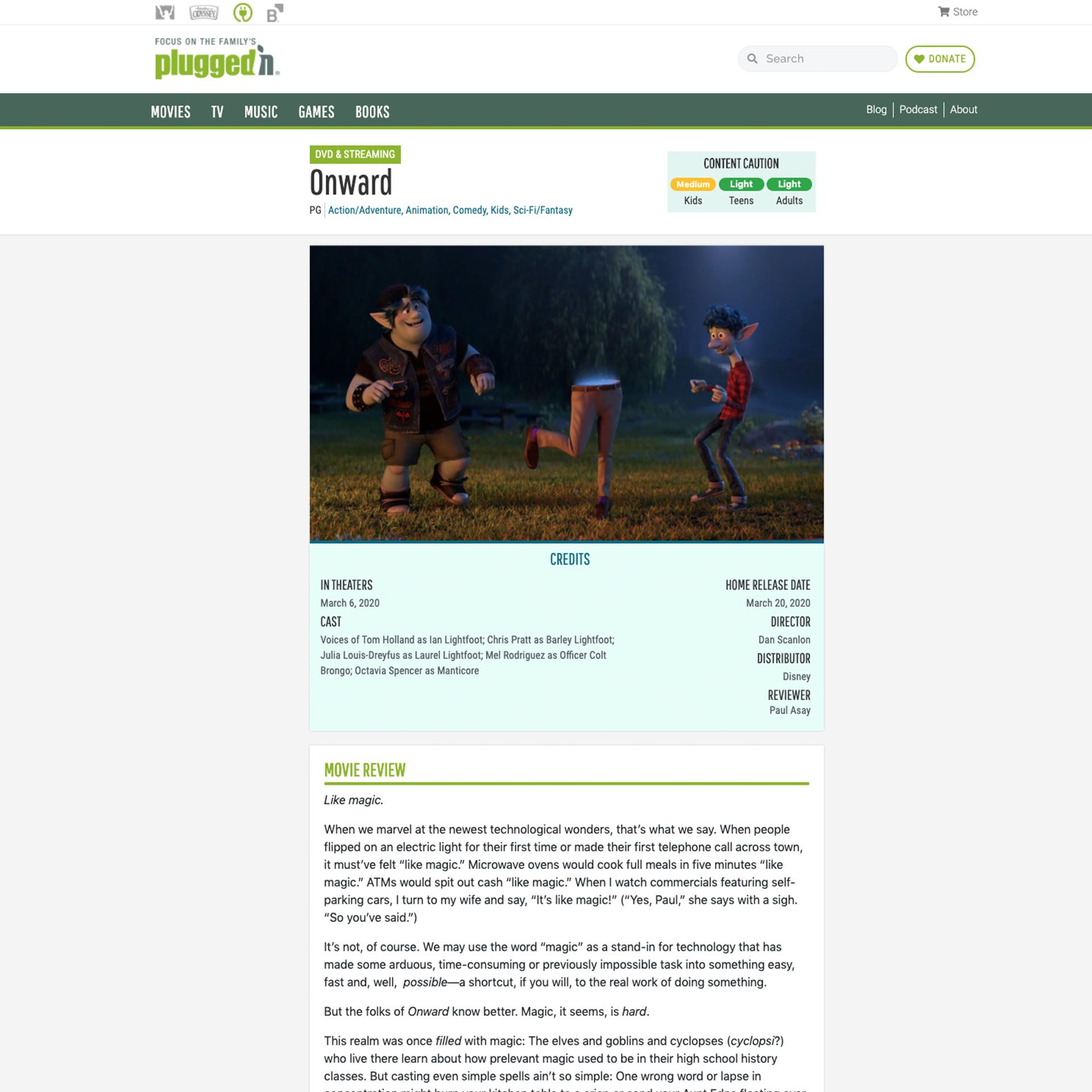
The Review layout had a lot of wasted space in the sidebar that never got any clicks. I removed that in the new design and focused on simplifying the experience of this page and highlighting some of the most pertinent information toward the top (such as title of the movie, genres, rating, and content caution).
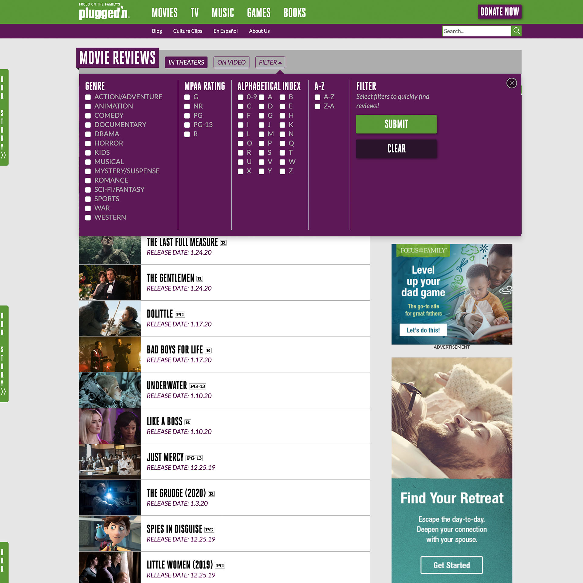
One of the worst features on the old site was the filtering functionality. The filters were hidden behind buttons that were easily missed, and only allowed the user to filter by In Theaters/On Video, genre, rating or sort by alphabetical order. Data showed that these were not utilized, so in order to provide the user with more filtering options and a more intuitive experience, I designed the search with a sidebar filtering design that dynamically filters the content as filters are selected. On mobile, the experience is easier to find the review the user is looking for by way of search or more available filters.

