Sleep Patient Dashboard Experience
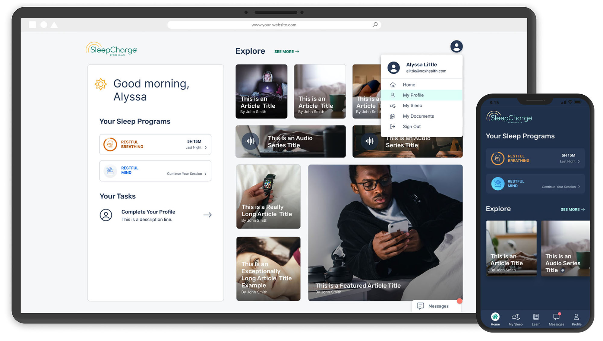
I redesigned the dashboard for a sleep patient app experience, resulting in increased task completion by 30% and a more personalized experience.
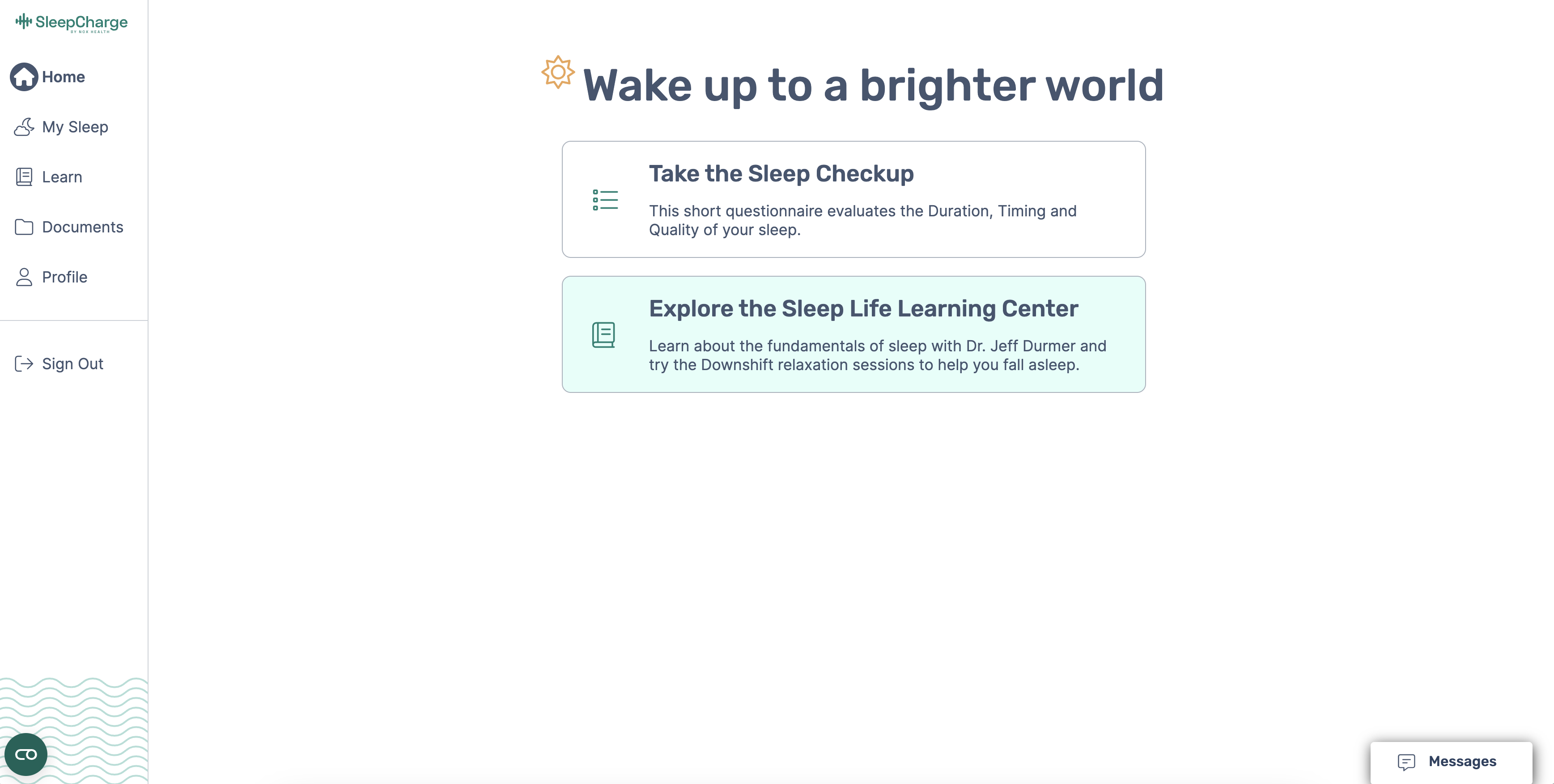
Before
After
The Challenge
The old dashboard design of the app was uninviting and didn’t prompt the user to take action. It included a list of tasks for the user as the first thing they see, but lacked personalization. I wanted the experience to feel customized to the user’s sleep programs and needs, so the users have a sense that we care about their sleep and want to help. In order to do that, I needed to research and design many various potential stages of a user’s sleep journey and ensure we designed the dashboard with intention, while personalizing sleep content for the user to consume that pertains to their personal sleep struggles. The other challenge I had to keep in mind while designing was that more programs and content would continue to be added, so it had to be scalable for more programs and content.
Stakeholder Interviews
In order to design a personalized home page dashboard, I needed to understand our sleep users and the types of content that would be most important for them to see on a home page. I interviewed our Product Owner and Product Manager to understand our users’ needs and motivations. I also studied our user journeys to ensure I included designs for each stage of the user’s journey.
Competitive Analysis
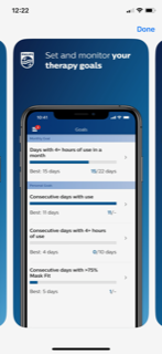
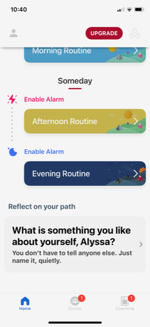
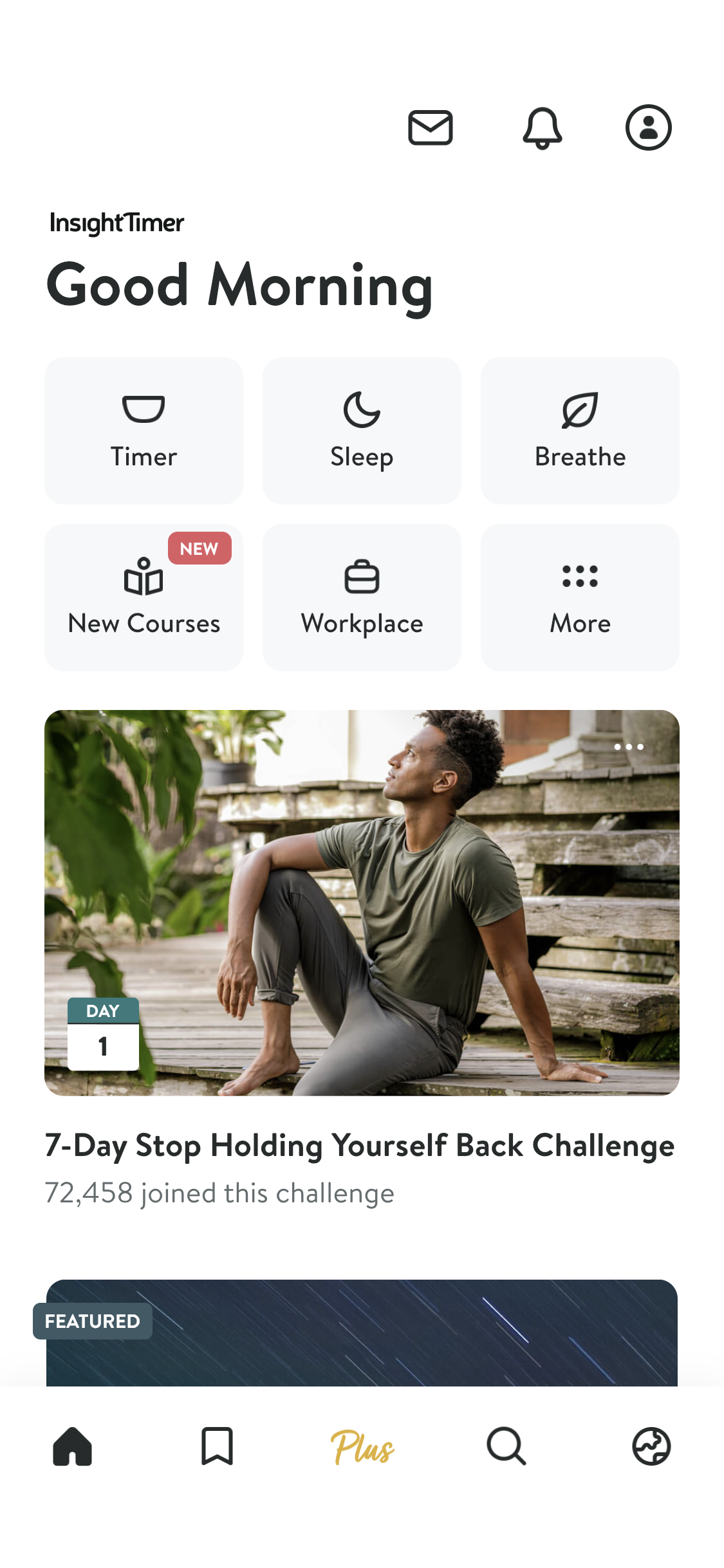
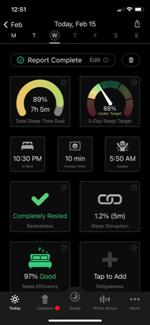
There are many sleep apps out there, and I downloaded many mobile sleep apps to use as inspiration. Some apps I analyzed for inspiration included Insight Timer, Sleep Watch, Fabulous, Phillips, Apple Watch, and Fitbit. I was looking for apps that highlighted important personalized data and prompted the user to navigate further to view more detail.
Wireframes
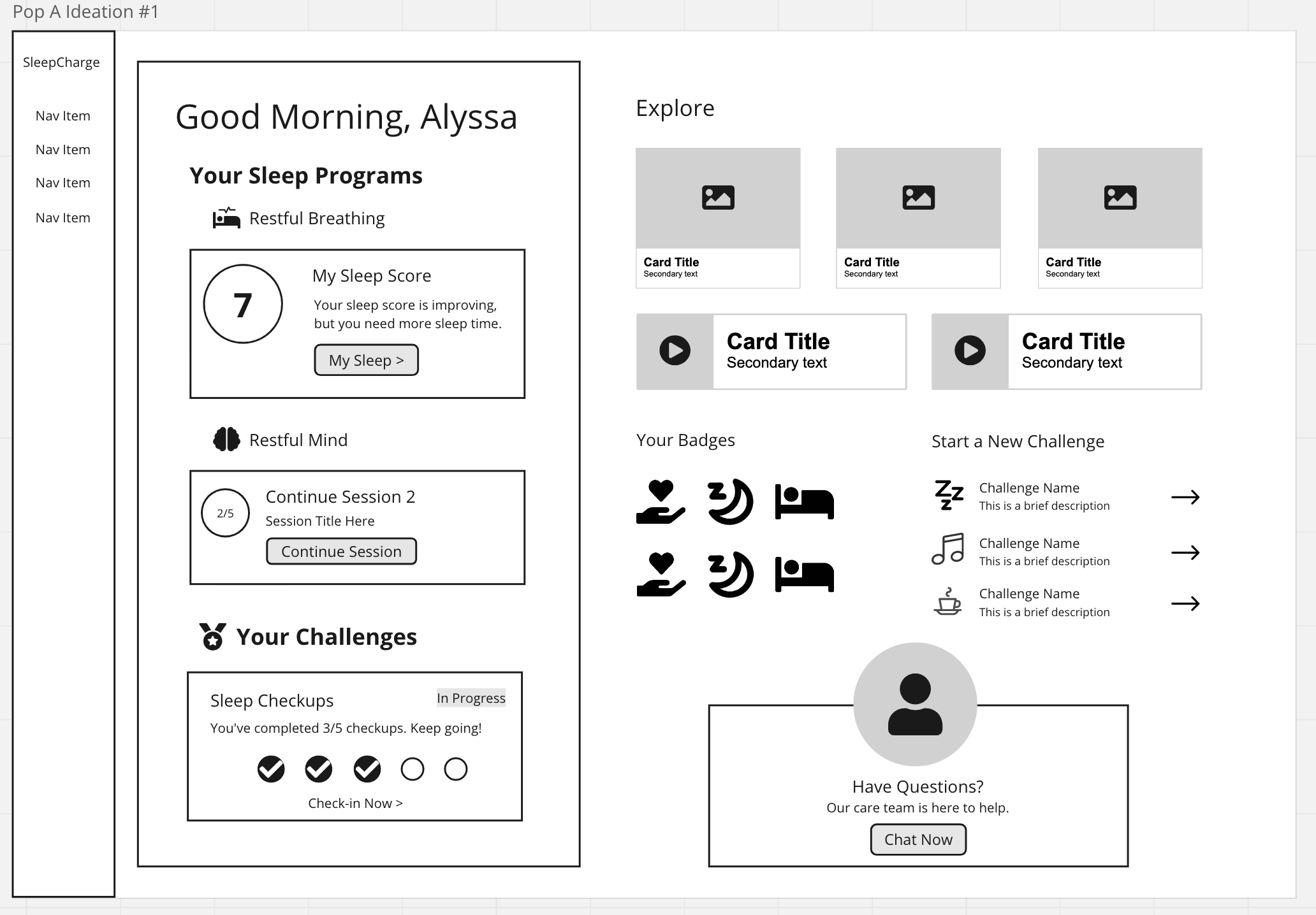
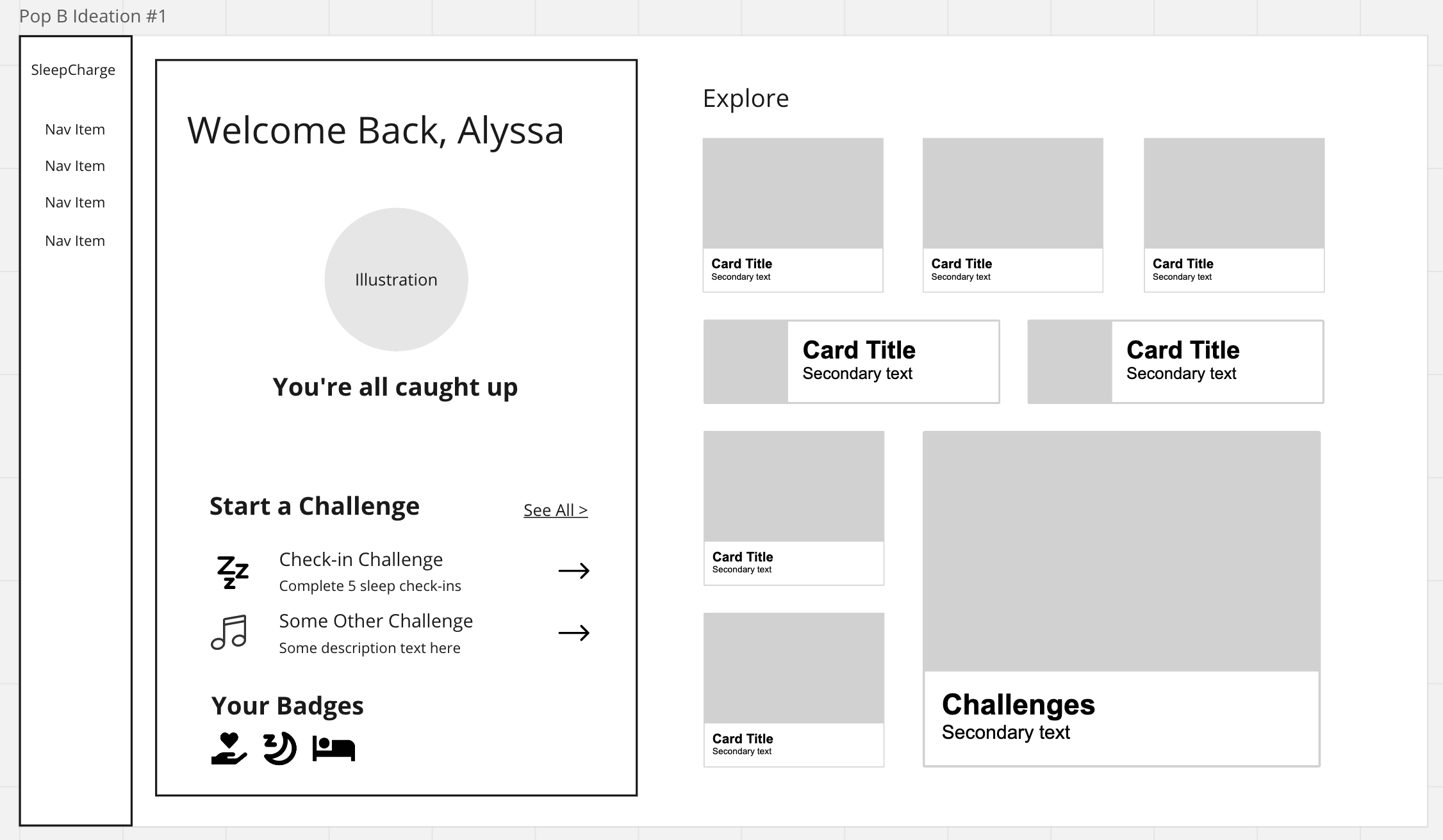
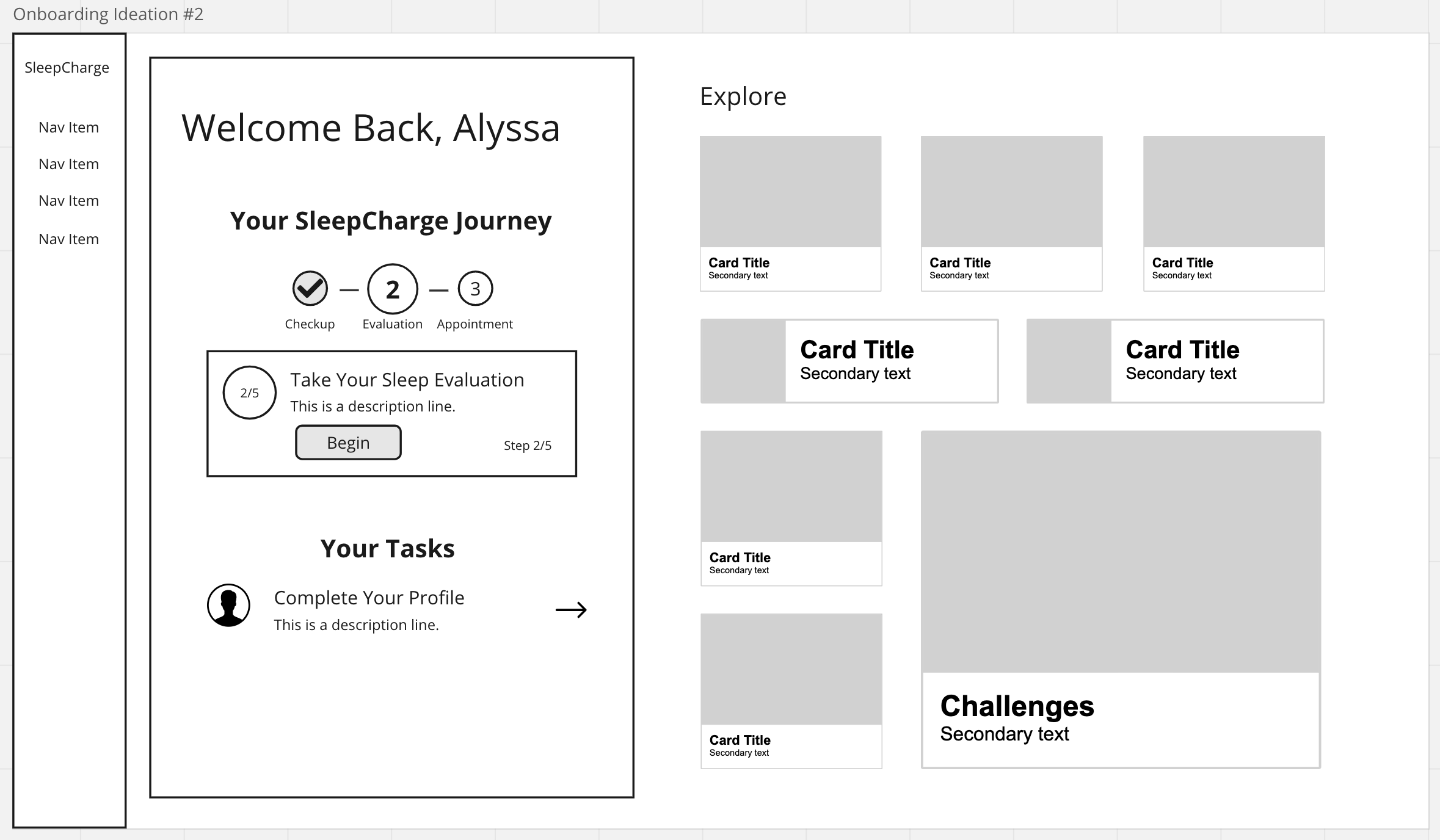
I used Miro for wireframes. The most important part of this design was including dynamic personalized sections that would change with the user’s status and stage in their journey. I also ideated some future wireframes and to show where we could enhance and further personalize the experience with challenges, badges, categorized content, and a collective sleep score based on the user’s progress with their sleep program.
Designs
Desktop App Design
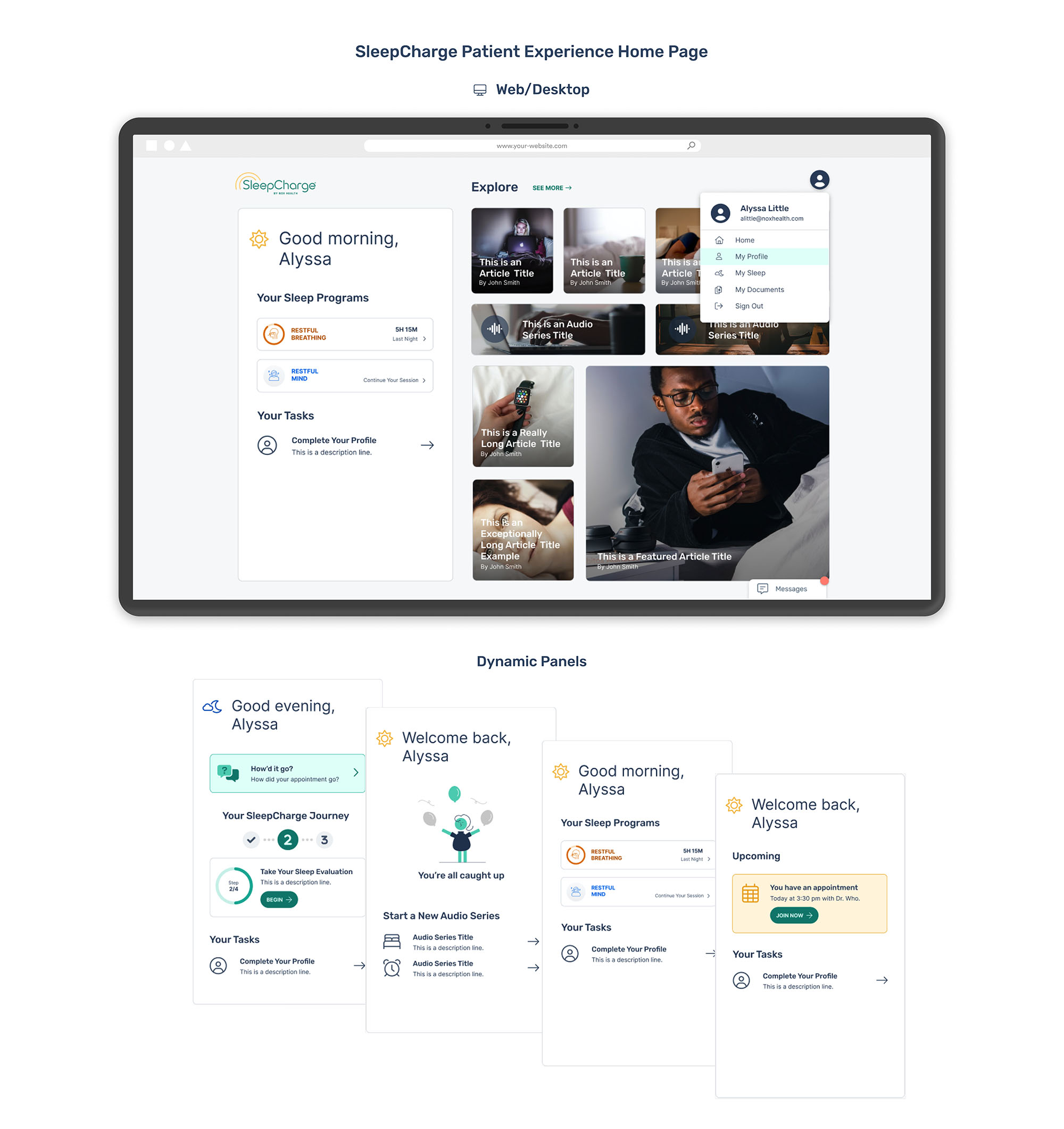
One of the ways I wanted to personalize the experience was by using dynamic content. The biggest change we made on the Desktop design was removing the side navigation from the old design and empowering the user to navigate the app without distractions. The other pages could still be found within the user menu, but I included other ways to navigate with Sleep Program cards, task calls to action, and content that would be personalized to the user’s needs.
The dynamic panels below show the various states for a user’s experience, based on where the user might be in their sleep journey. The user may be onboarding, needing to complete or all caught up on tasks, on a sleep program, or logging in for an appointment.
Mobile App Design
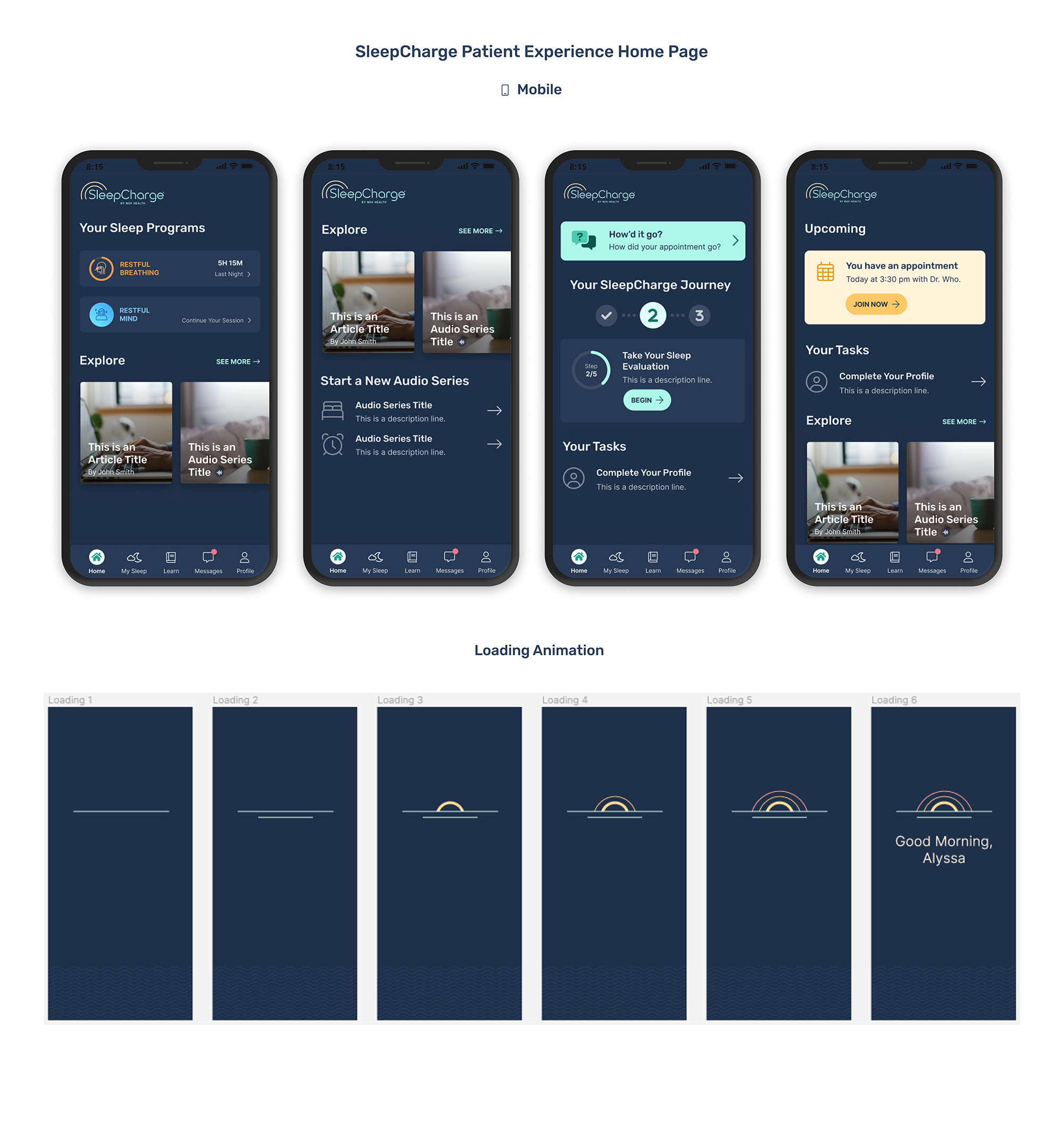
You will see similar cards on mobile, keeping the experience consistent with the web app. The difference with the mobile app is that it is designed with dark theme, so I designed each element carefully paying close attention to accessibility and contrast ratios.
One of the parts of the design that I enjoyed designing most are the loading screen animations. Here you will see a progression of a sunrise animation that greets the user with a personalized message.
Outcome
The work that went into this dashboard redesign resulted in a 30% increase in task completions and a more personalized sleep experience. I’m proud of the fact that users now have a dynamic dashboard that allows them to keep track of their sleep, jump back in where they left off in their sleep health journey, consume personalized content, and complete tasks with less friction.

Next Steps
My research on user engagement included suggestions to keep users returning to the app. One of those suggestions to stakeholders was to implement gamification and badging, so the users had reasons to return, complete their tasks, and feel a sense of accomplishment. That would be a great next step for this feature, and I was able to present those findings to stakeholders as an enhancement on the roadmap.

